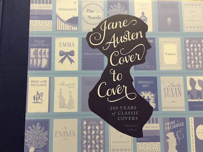
Jane Austen drew her last breath in 1817, and in the last 200 years her novels and stories have only grown more popular. Most Janeites love Miss Austen’s words, but Jane Austen Cover to Cover gives adoring fans a close look at the cover art — some amazing, some bewildering.
Author Margaret Sullivan showcases covers from the original editions published before Austen’s death, then works chronologically forward into the 20th and 21st centuries.
It’s an incredible spectrum — everything from the famous 1894 “Peacock Edition” to 1950s pulp, foreign-language translations, movie tie-in editions, teen editions, and more. Sullivan also includes snippets of history and excellent commentary on the designs and those who love (or hate) them.
Standout designs
I had little trouble deciding which designs I liked and which I didn’t, and there were several that elicited particularly visceral reactions.
1894 Peacock Edition – George Allen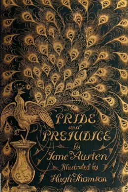
This art was drawn by Hugh Thomson, one of the most popular illustrators of the time, and started the trend of using peacocks in cover art for Pride and Prejudice. Thomson also filled the book with 160 black-and-white illustrations, as well as decorative chapter titles and initials.This edition has one more claim to fame: its forward contains the first use of the word “Janeites” to describe Austen fans. If you want your own copy, prepare to shell out around $500.
1994 Tor edition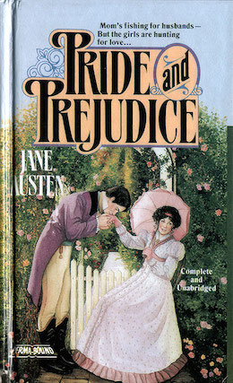
The first time I read Pride and Prejudice it was this exact edition — I remember my mom and I laughing and then shaking our heads at the terrible artwork and even worse tagline: “Mom’s fishing for husbands — but the girls are hunting for love…”
2006 – Penguin Red Classics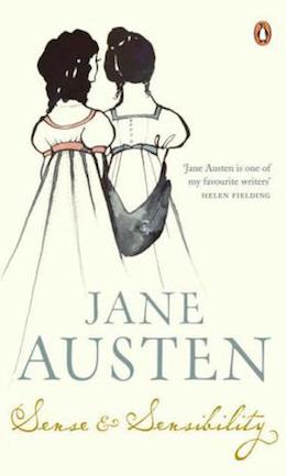
Penguin released special editions of five of Austen’s six novels, my favorite of which is Sense and Sensibility. Illustrator Kazuko Nomoto’s art is pleasing without being fussy or overdone.
2013 – Oldcastle Books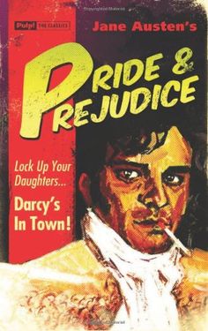
Is it me, or did it just get warmer? I have absolutely no idea what’s happening here, but I dig it. This faux-pulp edition of Pride and Prejudice fooled some people, but the fact that Darcy is the spitting image of Colin Firth is a dead giveaway that this isn’t a real 1950s edition.
Beautiful book design
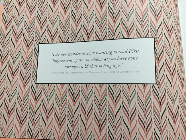
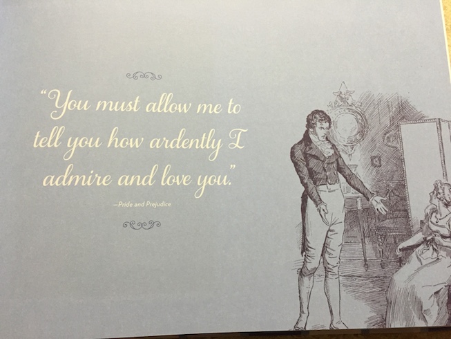
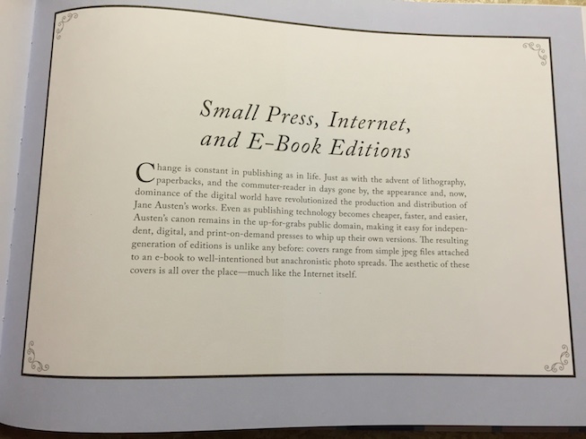
Great content deserves great design, and Jane Austen Cover to Cover does not disappoint. Not only does it have its own fantastic cover art, inside the colors, fonts, and flourishes work beautifully together to give the book an elegant, classic, cheerful feel.
It’s so well done that it’s almost a distraction from Austen’s covers.
If you love Jane Austen, books, and book design, Jane Austen Cover to Cover is the perfect next addition to your collection. It’s just beautiful.





Ooh this is going on my list!
It’s just a lovely read.